Magazine planning/inspiration
In order to plan my magazine front cover I began to look at fonts online for my masthead. I previously scanned through different fonts on Indesign, however I found that they weren't 'funky', 'Oldskool' or 'R&B' enough for me to use as my masthead. A masthead needs to be big, bubbly and be able to attract your target audience, so I used a website called 'www.dafont.com' and looked through the 'Oldskool' category for fonts. Straight away I discovered a font called 'Pincoyablack' which seemed perfect for my magazine. I've given an example of the font below saying 'Hannah'.

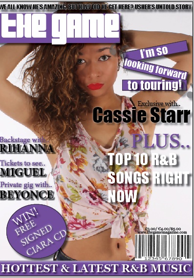
Making my front cover
Whilst making my front cover, I used many resources in order to help me such as going online and using 'Google Images', finding Vibe front covers and using them as inspiration in order to create mine. Also, my teacher helped me a couple of times with telling me what looks better on my front cover and what doesn't, aswell as giving me a magazine front cover to have a look at.
Making my double page spread
I'd already looked at previous double page spreads online so making my double page spread wasn't as hard as I thought it would be. Aswell as this, my teacher gave me a double page spread to look at and its particular layout inspired me so I used this to help me. I found that some particular features of double page spreads really stood out to me such as this Solange Knowles one below for example.

The feature I took from this double page spread was the different black and white stances posed by Solange; - I used this feature and interpreted it into my own on my magazine by using a black and white 3x3 grid of my model's different facial expressions. I thought this was quite a quirky and fun feature to add to my magazine that would definitely attract the audience's attention. This is what the grid/double page spread ended up looking like.

No comments:
Post a Comment