Friday 21 December 2012

Focus Group

Focus Group


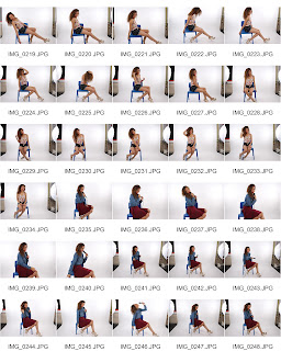
I cut this video on a program called 'Adobe Media Encoder' so that my input in the focus group discussion was viewable only. Looking at this video, I can see that I learned a few things from the focus group. In preparation for the video-taped discussion, I made sure to print out a few pages of my contact sheet and then I passed some of these out along the table during the video for everyone to look at and tick/cross/circle which pictures they thought would look best used as the main image on my magazine front cover. As you can see me explaining on the video here, when I took my contact sheets back in I found that people had circled mainly mid shots or close up and photos that my model weren't posing as much in. This portrayed to me that my target audience prefer pictures that are more natural and less forced/posed; - after the video I made sure to take this helpful information into account. 
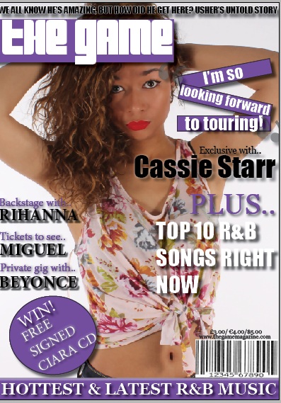
The focus group discussion really helped me because not only was I shown that natural photos are preferred by my target audience, but I saw that most people had agreed with my original choice of main photo to go with, which was a picture of my model in a floral top crossing her arms at the back of her head making direct eye contact with the camera. This suggested two things to me; - firstly that the fact that my model is wearing a floral top in this photo could suggest that my target audience prefer bright, fun and bold clothing that stands out to them.. also, it suggested that maybe they prefer to feel a personal connection with the model and that direct eye contact displayed in that particular photo covers this for them. After realising this, I made sure to not only use this photo on my front cover but I took into account these results to make sure my magazine's photos were as suitable as possible for my target audience. Furthermore, another aspect the focus group helped me on was that when I asked everyone in the group what price would be best suited for my magazine, the majority of people said around £3.00 or below. My previous price I'd set was a lot higher than this so I made sure to change my price. Therefore this feedback was very beneficial from my focus group.

This class discussion allowed us all to get our own primary research when getting detailed information  about things that would be successful in producing our magazine. We even discussed what doesn't look professional leading us to critisize each of each other's work but allowing us to receive beneficial feedback in how to improve. This also taught me what I should and shouldn't include in my magazine. The focus group was an effective research method as I was able to ask my own target audience relevant questions that could be linked to my own magazine so that I could individually receive feedback that would help me.
Furthermore, the purpose of the focus group was to be involved in getting interactive with others and saying what comes naturally instead of doing independant research on the pros and cons of magazines. The advantages of carrying out the focus group were:

  • We were able to receive information from non-verbal responses such as body language and facial expressions
  • Results can be easier to understand than complicated statistical data
  • We were able to learn about our target audience's personal opinions on many topics which made the focus group reliable as every individual in the group was my target audience's age, so I could trust that their answers could be generalised and be beneficial to the producing of my magazine
  • The process of the focus group wasn't particularly time-consuming as each topic was brought up, every person was able to give their input instead of everyone being interviewed seperately which would of taken a lot longer

R&B Magazine FIRST DRAFT

Magazine Eee PDF

This is my magazine first draft. Here, we have my front cover, 2 pages to my contents page and 4 pages to my double page spread. The magazine name I picked was 'the game' representing the competition between artists that they call the game. Ideally this gives my magazine a fiery feel to it as the audience will feel as if it will consist varying amounts of contrasting artists competing with eachother. I used the house colours of purple, black and white; - simple, classy and very R&B. As we can see, on my front cover I have used many sell lines to attract the audience and have made sure that they are bold with drop shadows in order to stand out. Furthermore, it has features to further attract the audience such as a mention of a prize at stake "WIN! Free signed Ciara CD" so that they are aware that they will get a reward back for their money's worth. On the contents page I have used a sort of triangular purple shape with a low transparency to add a 'funky' and quirky feel to the page. It will be intriguing for the audience to view a magazine with a few features to it that are different to the usual. For the listing of the contents' headings such as "on the cover" and "exclusives" I have used a 'fancy' script font that looks quite formal and pretty. I think this adds a classy edge to the magazine. I have used many pictures too, and at the bottom of the page I have put a picture of an iPhone with my front cover on it and text next to it stating that the reader can download an app for the magazine, and next to this is the 'Twitter' logo allowing the reader to follow us on the social networking site. This allows my young audience involve themselves with my magazine online too which is what many teenagers nowadays like to do; - go on social networking sites. As you can see at the bottom of each page I have put the month and year "December 2012" and the page number in bold next to it, so that the audience can easily navigate through my magazine. On the double page spread I have used a white quote from the article to instantly capture the reader's attention, and then "CASSIE STARR" in capitals. The text runs throughout the page, laid-out organised and easy to navigate through. Then, I have put a black and white 3x3 grid of close ups of my model doing different facial expressions. I figured that the black and white colour adds a classy look to the page but yet the juxtaposition between my model's contrasting facial expressions creates a quirky look to it that the reader may instantly be drawn to. At the bottom of the page, I have also added some slanted pictures of my model supposedly "at her last photoshoot" and her "excstatic at her fans' reaction to her new album release". This adds a realistic feature to my magazine as it is almost giving evidence for the things "Cassie" has done and events that have happened such as these. On the second two pages of my double page spread I have used a long shot of my model inbetween the text and also a mid shot just to seperate the text and keep the reader interested in what is being said and the pictures being shown.

Props and Costume

Props & Costume

This props & costumes powerpoint presents my model's clothing, makeup and props used and it establishes my reasons & intentions behind why I chose these for her to use. This helped me because it allowed me to discover the R&B look for most females.

Thursday 20 December 2012

Magazine planning/inspiration

Magazine planning/inspiration

In order to plan my magazine front cover I began to look at fonts online for my masthead. I previously scanned through different fonts on Indesign, however I found that they weren't 'funky', 'Oldskool' or 'R&B' enough for me to use as my masthead. A masthead needs to be big, bubbly and be able to attract your target audience, so I used a website called 'www.dafont.com' and looked through the 'Oldskool' category for fonts. Straight away I discovered a font called 'Pincoyablack' which seemed perfect for my magazine. I've given an example of the font below saying 'Hannah'.

I found that this font was edgy and very R&B with the long curves slanting off of some of the letters. I figured that this font would be perfect to use for my masthead and infact I did use it in the end. This is what the masthead font on my front cover ended up looking like.


Making my front cover
Whilst making my front cover, I used many resources in order to help me such as going online and using 'Google Images', finding Vibe front covers and using them as inspiration in order to create mine. Also, my teacher helped me a couple of times with telling me what looks better on my front cover and what doesn't, aswell as giving me a magazine front cover to have a look at.

Making my double page spread
I'd already looked at previous double page spreads online so making my double page spread wasn't as hard as I thought it would be. Aswell as this, my teacher gave me a double page spread to look at and its particular layout inspired me so I used this to help me. I found that some particular features of double page spreads really stood out to me such as this Solange Knowles one below for example.


The feature I took from this double page spread was the different black and white stances posed by Solange; - I used this feature and interpreted it into my own on my magazine by using a black and white 3x3 grid of my model's different facial expressions. I thought this was quite a quirky and fun feature to add to my magazine that would definitely attract the audience's attention. This is what the grid/double page spread ended up looking like.

Diary: 20/12/12

Diary: 20/12/12   


Transcript: Today I continued to work on my R&B magazine, completing final features of my front cover and my contents page. Then I began to work on my double page spread, making sure to make it look professional and organised. The hard part I found about this lesson was that I didn't quite know where to place the images and I also found it quite hard to complete my whole first draft within the lesson. However, the good thing I found about this lesson was that I quite enjoyed creating and designing my magazine and making it look how I wanted it to.

Saturday 15 December 2012

Diary: 12/12/12


Diary: 12/12/12


part 1:


part 2:


part 3:


Transcript:   Today I began to work on my focus group video and cut it so that it was just focused on the parts where I either asked questions or gave feedback on the my results I'd received.  I exported this into a film file and then tried to upload it to YouTube, however YouTube didn't allow me to sign in; So I decided to save the uploading for another day when it works. So, after this, I continued working on editing a photo of my model which I will be using for the front cover of my magazine. It's a mid-shot, and it was voted by the majority of my focus group to use as my front cover's main image so I took these results into consideration. As I explained in my last Project Log, I have started to airbrush my model's skin and enhance some of her features such as her lips, and cut out unnecessary blemishes to the photo for example a piece of misplaced hair. I found that comparing the almost-finished and edited photo to the original photo, made me realise that editing really will help the attraction towards my magazine. Aswell as this, I remembered to upload my Contact Sheets to my blogger, too.  Next lesson I am aiming to finish editing the photo of my model and hopefully begin to create my magazine front cover on a program called 'Indesign'. It would be easier to be able to start on these things at home too, however I don't have the programs on my computer at home so I have to wait until I get to school.

Wednesday 12 December 2012

Contact sheet


This is a little flip book of my contact sheets made using a website called "photosnack.com". I thought it would be a fun and different way of presenting my contact sheets so that a variation of different presentation techniques are used on my blog.

However, if Photosnack doesn't work for you on your PC then alternatively I have my contact sheets also presented below:


This is my contact sheet of my photoshoot, including all of the photos I took of my model. As you can see, all of the photos are very contrasting as my model wore different oufits to have  different effects. For example, in the first several photos she wore high-waisted denim shorts and a pink floral crop top that tied up. This portrays a 'fun and flirty' vibe which is very casual with the tie-up but very 'girly' with the pink colour to it and the different coloured flowers on it at the same time. Also, she wore a denim shirt and burgandy-red skirt in the next several pictures to develop a 'classy' and smart look. She also put her hair up for some photos to create a classy and sophisticated look and had her hair down in others for a more relaxed and feminine look. In some other photos she put a furry leapord jacket over this outfit also to create a quirky and different look. I knew that the leapord print pattern would really stand out with the R&B genre and instantly catch the audience's attention. Furthermore, I made sure my model used lots of different poses to make sure all the photos were different and contrasting, and also made sure to capture some natural photos of her when she was unaware, so that they didn't all look too forced and posed, which might put some readers off. I didn't want my model to look too superficial that it would drive away the reader, so I made sure she looked relaxed and natural in some photos so that the reader would feel accepting and laid back veiwing them.

Tuesday 11 December 2012

Conclusion & evaluation of my audience data/quesionairre results


This is a Word Document of the evaluation of my audience data/questionnaire results. It presents what I have concluded about each question's results and what they show. This evaluation has helped me a lot because it's guided me through how to change certain aspects within my magazine and my proposal etc..

Diary: 06/12/12


Diary: 06/12/12


Today I created my contact sheets with all the photos I had taken of my model at my photo shoot. Once I had done this, I saved them to my home folder and began picking out a picture for my magazine front page and editing it. Ms Baker advised me to airbrush my model's skin on photoshop and fix any blemishes and perhaps enhance some colours such as the red on her lips etc.. One easy aspect I found about this lesson was that I already knew how to use photoshop and am quite good on the computer so I found it quite quick and easy to navigate myself around and get myself working. Aswell as this, I used my initiative and used other sources instead of just the teacher to help myself such as 'YouTube'. On YouTube I found a clip that further helped me with editing my model's face on Photoshop. However, one difficulty I found with this lesson was just creating my contact sheets as they took quite a long time to be created and I had to get help from my teacher in order to do this.


This is a video of me editing my model using Camstasia Studio just to further portray to you how I fixed blemishes on her skin, adjusted contrast, etc etc.:

Audience data/questionairre bar chart

115587691 Graph for Questionairre

This is an EDEXCEL DOCUMENT presenting the bar chart/results to each question of my magazine questionairre. I was shocked yet satisfied with these results because they gave me an exact indication as to how to develop my magazine and make it good according to my target audience.

Diary: 05/12/12

Diary: 05/12/12 

Transcript: Today I uploaded my questionnaire for my magazine to my blogger and I also uploaded my bar chart/results for my questionnaire too. As well as this, I began to look through the pictures I had taken at my photo shoot of my model and began to think of ideas for what picture I should use for which page on my magazine. The easy thing I found about this lesson was that I had clear intentions and ideas for what I wanted to use on my magazine and how I wanted to create it, however a difficult thing I found about this lesson was that there were so many pictures to choose from that I wasn't sure which one to choose.

Tuesday 4 December 2012

Magazine questionairre

Question Air Re

This is the questionairre I created for my magazine. It includes questions that the answers would give me a lot of helpful feedback and would certainly help develop my magazine further. I gave out these questionairres to my class mates who were the age of my magazine target audience so I knew that I could generalise the results of the questionairre to the rest of my target audience and use the results in advance to make sure my magazine is well-created to suit this audience.

Monday 3 December 2012

Music magazine planning: 03/12/12

Music magazine planning: 03/12/12

Image ideas

This is just personal inspiration I decided to gather up in preparation for my photoshoot tomorrow, including pictures of poses R&B artists have done and a few ideas I've jotted down in order to help me and my model to capture some really good pictures/poses. These are pictures/poses I've found on the internet that really stood out to me and that I've decided would be effective poses for my model to do because they fit in with the R&B genre.
Poses and Ideas Inspiration for Photoshoot

New Media


This Prezi presents the new Media today that are different modern techniques of advertising Media, such as Twitter, Facebook, Phone Apps and other techniques. I explained how I will use these modern techniques in advertising my magazine and even created a "Twitter" account in order to do this.

Sunday 2 December 2012

Model release form


This is a presentation of my model release using a website called "Photosnack" which is like an online animated flip book. I thought this would be a good, fun and different presentation technique to use for this.

However, incase the Photosnack feature doesn't work on your PC, alternatively my model releases are also here:


Promotional Methods

Promotional Methods

This powerpoint establishes all of the techniques in how I can promote my magazine; - both traditional and modern methods in order to suit the younger and older side of my target audience and how they like to approach reading a magazine. The modern methods include ones such as apps on mobile, social networking sites such as Twitter and Facebook etc.. Whereas the traditional methods include ones such as advertising through posters, newspapers, handouts, TV and more.. This way perhaps if a 20-year-old for example doesn't like to use technology, they can still see my magazine advertised through a handout for example. Whereas maybe if a 17-year-old is on Facebook, which is what a lot of teenagers use nowadays, they may see my magazine advertised there online and decide to read it. Therefore these promotional methods suit all types of readers and can access every single person to my target audience.